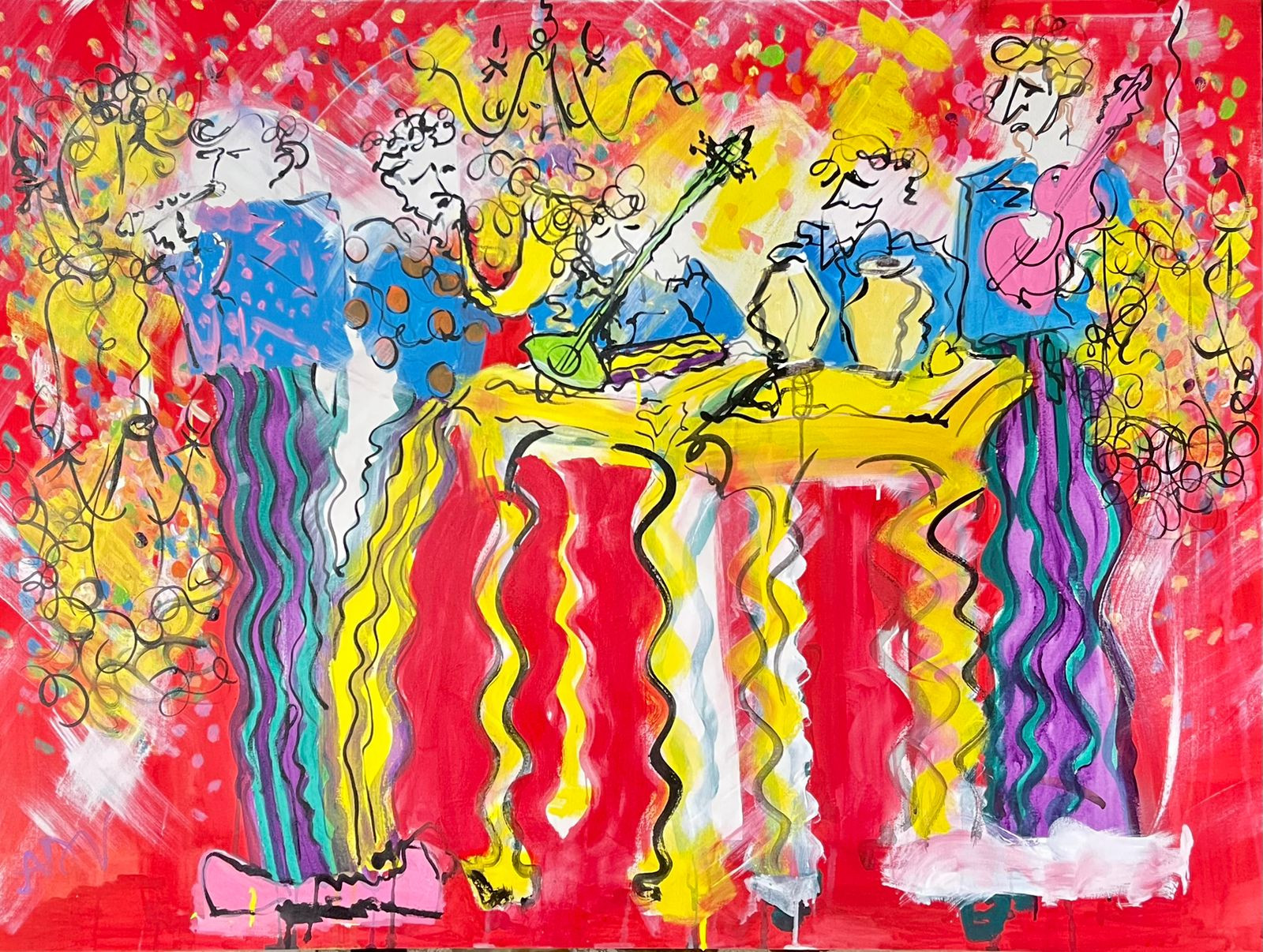
Color theory is a set of practical guidelines that explains how colors mix, interact, and influence emotions in artwork. Built around the color wheel and the properties of hue, value, and saturation, it helps beginners choose palettes intentionally, create harmony or contrast, and direct the viewer’s attention. At Ejaz Art Gallery in Lahore, our curators and artists use these principles daily—explore live examples in our collections and exhibitions to see how color shapes mood and narrative.
The color wheel organizes colors by how they relate to each other, making it easier to predict what combinations will look cohesive.
Primary colors (RYB): Red, yellow, blue—cannot be mixed from other paints.
Secondary colors: Orange, green, violet—made by mixing primaries.
Tertiary colors: Red-orange, yellow-orange, yellow-green, blue-green, blue-violet, red-violet—made by mixing a primary with the neighboring secondary.
Why this matters: the wheel visually encodes relationships, such as complements (opposites) for high contrast and analogous neighbors for gentle harmony. For real-world examples of wheel-based palettes, browse featured works in our online collection at Artworks.
Hue is the color family (red, blue, green).
Value is how light or dark a color is. Light values (tints) come from adding white; dark values (shades) come from adding black. Value contrast is the strongest driver of focal points—get your values right and your composition will read clearly, even in grayscale.
Saturation (chroma) is the intensity of a color. Highly saturated colors feel vivid and energetic; desaturated colors feel subtle and atmospheric. Beginners often overuse saturation—reserve your most intense color for the focal area and mute supporting regions.
Warm colors (reds, oranges, yellows) advance and feel active, optimistic, or dramatic.
Cool colors (blues, greens, violets) recede and feel calm, spacious, or contemplative.
Temperature is relative: a warm blue can exist next to a cooler blue. Use temperature shifts to separate foreground from background or to guide the eye. You’ll find nuanced temperature control across our painting selections in Paintings in Lahore.
Complementary: Opposites on the wheel (blue–orange, red–green). Delivers maximum contrast and energy; great for focal points but can look harsh if both sides are fully saturated.
Analogous: Neighbors on the wheel (yellow–yellow-orange–orange). Feels cohesive and soothing, ideal for landscapes and atmospheric works.
Triadic: Three evenly spaced hues (red–yellow–blue or green–orange–violet). Balanced and lively; control value and saturation to avoid visual noise.
Split-complementary: One hue plus the two neighbors of its complement. Adds contrast with less tension than a pure complement.
Tetradic (rectangle): Two complementary pairs. Powerful but requires careful value hierarchy and neutral buffers to stay unified.
Pro tip: Pick one dominant hue, one supporting hue, and allow neutrals (off-whites, grays, earths) to create breathing room.
Everything is equally bright: Reduce overall saturation and let one accent carry the vivid punch.
No clear focal point: Increase value contrast and edge sharpness where you want the eye to land.
Clashing complements: Desaturate one side of the pair or use split-complementary instead.
Flat images: Layer warm/cool shifts and step your values to create depth.
Overreliance on pure black/white: Use chromatic darks and tints to keep color relationships alive.
Grayscale first: Paint a small study using only values; then glaze color on top to see how hue supports value.
Limited palettes: Try Zorn (yellow ochre, vermilion/cadmium red, ivory black, white) or primary triads. Limitation builds sensitivity.
Temperature swapping: Re-paint the same subject once with a warm dominance and once with cool dominance, comparing mood and depth.
Edge and neutral practice: Mix near-grays from complements (e.g., red + green) to control edges and keep harmony.
Abstract art: Lean on saturation and temperature to express rhythm and emotion; value anchors the composition.
Figurative and portraiture: Value structure models form; temperature shifts bring life to skin tones.
Landscape: Analogous bases with strategic complementary accents enhance space and atmosphere.
Contemporary mixed media: Use neutral grounds and intentional pops of high-chroma color to unify diverse materials.
For a deeper context on how contemporary artists deploy color in narrative and abstraction, read our feature The Evolution and Impact of Contemporary Art.
If you’re curating for interiors or planning a collection, our team can help you match palettes to space and lighting—start with our curated selection of works and exhibitions at Art Galleries in Lahore.
Tint: Hue + white.
Shade: Hue + black.
Tone: Hue + gray or complement for subtlety.
Simultaneous contrast: Adjacent colors influence each other’s appearance; a gray next to orange may look bluish.
Metamerism: Colors can shift appearance under different light sources; test your palette under daylight and warm indoor lights.
Start with the color wheel, learn hue/value/saturation, understand warm vs cool, and practice simple harmonies like analogous or complementary before moving to complex schemes.
Analogous is the most forgiving and cohesive. Add a small complementary accent for a focal pop without overwhelming the palette.
Choose a harmony, lock a value plan, and limit high saturation to the subject. Use neutrals to separate elements and prevent visual noise.
Value typically leads to readability and depth. Nail your values first, then adjust hue and saturation to fine-tune mood and emphasis.
Warm colors feel energetic and advance; cool colors feel calming and recede. Alternating them can create depth and guide the viewer’s eye.
Color theory isn’t a rulebook—it’s a toolkit. Start with a clear value plan, choose one harmony, control saturation, and let temperature shape space and mood. To see these ideas in action across diverse styles and mediums, explore current and past works at Artworks and browse locally created pieces at Paintings in Lahore.
Art has the remarkable ability to transcend time and culture, offering a glimpse into the
In the vast and colorful world of art, there exists a profound genre that has
In the realm of artistic expression, abstract art stands as a testament to the boundless